Email best practices
6 clever newsletter graphics tips with examples
Without graphics, newsletters just look as dull as legal documents. Add some pizzazz to your newsletter design with this selection of graphical elements.

PUBLISHED ON
Ready to transform dull, text-heavy emails into lively messages your audience will actually open?
In this guide, you’ll learn exactly how to make newsletter graphics that wow your subscribers every time. It’s now simpler than ever to spice up your newsletters with must-click visuals that reflect your brand’s personality.
Before diving into specific design tips, let’s look at why these visuals are so powerful and what they can achieve for your email marketing campaigns.
Table of contents
1. Plan your color palette
2. Gather your visual elements
3. Position your CTA strategically
1. Use infographics
2. Play with colors
3. Use hand-drawn graphics
4. Add motion
5. Emphasize a theme
6. A/B test
Mailjet’s email template generator
Basic design editors
Graphic design software
Built-in email design features
1. Miro’s infographic-focused welcome campaign
2. True Grit Supply’s unique illustrations
3. Chubbies gifs
Don’t overload
Don’t use low-quality graphics
Don’t depend on background images
Why newsletter graphics matter
Eye-catching visuals communicate your brand identity, highlight core messages, and set the right tone for readers. By weaving strong imagery into your newsletter design, you can improve click-through rates and give subscribers the impression of a polished, creative brand.
Well-placed graphics also help break up text, making your email easier to scan and more enjoyable to consume.
How to create effective newsletter graphics
Creating on-brand newsletter design doesn’t require a huge budget or a professional art degree. Follow this step-by-step framework to guide your creative process:
1. Plan your color palette
Pick colors that represent your brand and evoke the right feeling for your audience. Stick to consistent tones across headlines, backgrounds, text, and images to maintain brand cohesion – subscribers like receiving newsletters from brands they trust.
2. Gather your visual elements
Compile images, icons, or illustrations that suit your content. Ensure each choice complements your color palette. High-resolution, engaging visuals give your newsletter a professional look and build trust.
3. Position your CTA strategically
Place your calls to action at eye-catching spots in the layout. Pair them with relevant visuals or icons that gently nudge readers toward that important click.
Mailjet’s Brand Kit allows you to store and apply your brand’s fonts, colors, and logo to every email by just copying and pasting your URL into the template builder. This ensures that every email matches your brand identity, whether it’s created by you or another team member.
6 tips to effectively use graphics in newsletters
There are many ways to create a creative design newsletter without complicated software. Let’s explore how well-chosen visuals help boost engagement and deliver a memorable brand experience:
1. Use infographics
Present data in a visually appealing format. Short text, clear icons, and simple charts allow readers to grasp essential information quickly. We even put together a little newsletter design infographic:

2. Play with colors
Experimenting with the color scheme in your newsletter gives you a way to convey different moods and evoke an emotional response from your audience. Tools at your disposal include various hues of the color palette, gradients, color blocking, and the overall layout.
You can also test different text shades and see how they relate to the surrounding images to help get your message across. Colors allow you to create and express your vision for your brand.
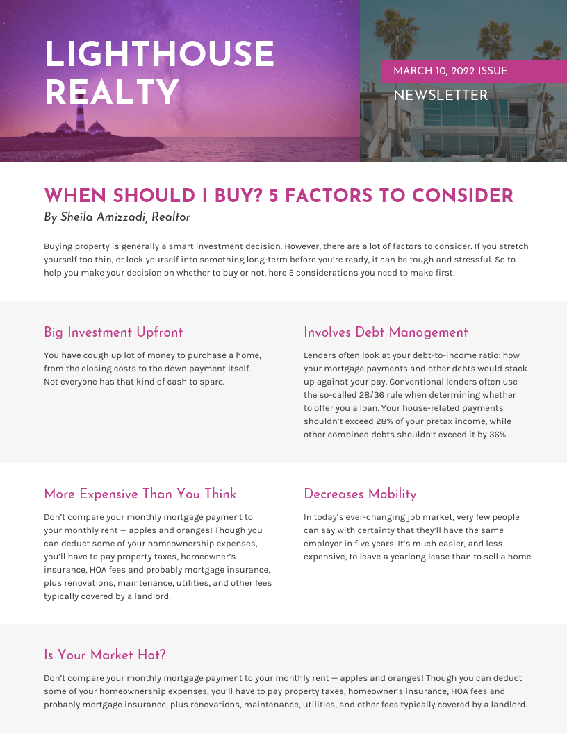
Vengage’s purple newsletter is easily recognizable.
3. Use hand-drawn graphics
Hand-drawn graphics add a personal, human touch to the design elements of your company newsletters. Adding hand-drawn highlights to your newsletter can change the design's whole mood and make it more inviting and personable. Some options include drawing pictures, underlining information, using arrows, or writing stylized text.

Coach’s hand-drawn newsletter leads the eye to the next product.
4. Add motion
Adding motion to visual elements in your email campaigns enlivens the tone and grasps your readers’ attention, encouraging them to learn more in a lighthearted fashion. Positioning an animated GIF at the center of the newsletter on a neutral background attracts the attention of your target audience. Toss in your essential information and an adjacent CTA to increase your conversion rates.
Going beyond your standard email by adding interactive newsletter elements creates a unique experience for your subscribers.
5. Emphasize a theme
A clearly defined theme in your business newsletter emails can set it apart from the pack. Unlike something bland and inconstant, a strong theme generates customer interest, curiosity, and further communicates your brand's identity. The theme can also tie into the unique subject of the newsletter, using visual cues to convey information.

Serumize’s newsletter uses a unique combination of dark green and light pink.
6. A/B test
An effective email newsletter design attracts new customers and helps your brand to succeed. It’s important to know if one newsletter design performs better than another, which you can do by completing an A/B test.
With an A/B test, you send out one newsletter version to a specific audience segment and another to a different group. Then, after compiling the results, you send the newsletter with the highest click-through rate (CTR) to a third group. This method eliminates the guesswork in designing an effective newsletter.
Practical tools for newsletter graphics
These resources can simplify your workflow and ensure appealing, on-brand visuals:
Mailjet’s email template generator
The email template generator makes creating personalized campaigns faster and easier. It automatically produces custom templates – with on-brand copy, subject lines, and designs – so users can launch polished emails in a fraction of the time, without the manual work.

Basic design editors
Easy-to-use online tools like Canva or Crello offer pre-built newsletter templates and drag-and-drop functionality.
Graphic design software
Advanced programs like Figma or InDesign provide extensive style options for layouts, typography, and specialized newsletter illustration.
Built-in email design features
Many email service providers include an email editor and stock image library so users can build newsletters efficiently.
Real examples and case studies
Strong visuals can truly transform a simple email into something your audience anticipates. Below are three quick brand-centered highlights:
1. Miro’s infographic-focused welcome campaign
Miro’s welcome email is a great example of how to combine education and engagement in a single touchpoint.
Instead of a wall of text, it features a simple infographic that breaks down how to get started in just three steps.
It’s a smart way to guide new users through onboarding while reinforcing the product’s value visually. If you’re looking to drive early activation, this kind of infographic-driven email is a strong model to follow.

2. True Grit Supply’s unique illustrations
True Grit Supply nails the product launch email by turning feature education into a visually compelling scroll.
Instead of a bland feature list, the email uses bold graphics and numbered sections to walk readers through four key benefits of their RIZZCRAFT system – from easy brush-based setups to tactile effects and ink blending.
Each section includes a CTA (“Get it here”) that feels purposeful without being pushy. This is a great example of how to use a launch email to both excite and educate your audience at the same time.

3. Chubbies gifs
Chubbies always finds a way to make utility feel fun. Even something as simple as showing how to flip their new jackets inside out becomes a moment of brand personality. It’s clever, eye-catching, and genuinely helpful for potential customers.
The don’ts of newsletter graphics
Here are some email newsletter graphic faux-pas to avoid.
Don’t overload
Overusing big images can slow loading times or overwhelm readers. Make sure visuals serve a clear purpose.
Don’t use low-quality graphics
Pixelated or blurry logos and photos can hurt user perception. Stick to crisp, on-brand images for a professional look.
Don’t depend on background images
Many email clients block background images by default. Select color-based backgrounds, and ensure text is legible on its own.
Create visually appealing newsletters with Mailjet
Mailjet's suite of email design features make developing standout newsletters straightforward. You can choose from professional newsletter templates or build your own layout with the drag-and-drop Email Editor. Simplifying A/B testing also ensures each design element contributes to higher click-through rates and ongoing subscriber loyalty.
Ready to bring your designs to life? Then try out the new email template generator.
