Email Best Practices
6 great newsletter examples with actionable insights
Looking for best newsletter examples? We compiled 6 great newsletter samples so that you can get inspired and create beautiful newsletters.
PUBLISHED ON
At Mailjet, we see a lot of great email newsletter examples. Some of them are funny, some exciting, others engaging. But one thing is for sure - creating email newsletters is never straightforward. Each one requires creativity, contribution from your team members, an analysis of how past campaigns have performed and what you can learn from them moving forward.
So, to give you some inspiration, we have compiled six excellent email newsletter examples that we really liked at Mailjet, and actionable insights that you can apply.
Before we jump into some inspo, take a look at our step-by-step guide on How To Create An Email Newsletter.
Table of contents
Table of contents
01Newsletter example #1: The haunting creativity of AdWeek’s Webinar newsletter
02Newsletter sample #2: The pop-culture savviness of this Google Home Mini product marketing email
03Newsletter example #3: Really Good Emails’ personalized weekly newsletters
04Newsletter example #4: The simple elegance of Taylor Stitch’s menswear email
05Newsletter sample #5: Station F’s exuberant originality
06Newsletter example #6: The rich media of this DMA Awards-shortlisted Blue Planet II email newsletter
Newsletter example #1: The haunting creativity of AdWeek’s Webinar newsletter
AdWeek's Haunting Webinar Newsletter
Why it works: Sometimes, creativity doesn’t need to involve flashy design or rich media. Sometimes, it doesn’t even need to involve a lot of content. This AdWeek email takes simplicity to a new level by letting anonymous speak. Anonymous is a woman; she has a pixelated stare, and she doesn’t want to get personal with you. It’s haunting, and it doesn’t need to do a lot to show a lot.
Actionable insights: A striking above-the-fold image like this one works like an effective subject line; it incites users to become receptive with the email content.
Optimize CTAs by placing them after specific engagement points. AdWeek places them (1) after the striking image and (2) the description. Including a CTA above-the-fold will ensure that users don’t miss it.
Newsletter sample #2: The pop-culture savviness of this Google Home Mini product marketing email

Google Home Mini's Marketing Newsletter
Why it works: Google’s product marketing newsletter sample is pretty rad and well-designed. Featuring a slick, white canvas, the one-column layout directs attention to its references - a Weekend playlist, KEXP radio, House of Cards, and the Mad Libs game. Let’s be honest, this email would not have the same impact if music they referenced was, say, Satie’s Gymnopedie.
While these may seem random, they provide an implicit statement - that they are current and aware of modern cultural references, and that Google Home can play them if you simply say so. It’s ingenious. And of course the plethora of streaming services listed just increases Home Mini’s appeal as a personal voice-recognition device. With effective marketing newsletters like this and a banging Cloud Platform, Google is unstoppable!
Actionable insights: Cultural references drive up engagement, even in email marketing. Use them to your advantage. Your references don’t need to be industry-related (although that may help if you’re marketing towards specific niches).
Including the logos of top brands will increase the hype surrounding your product by emphasising its credibility. Google Home Mini is compatible with a lot of streaming channels people use on a daily basis. At Mailjet, we have a Success Stories page for big companies that are very happy using us as their ESP.
Newsletter example #3: Really Good Emails’ personalized weekly newsletters
Really Good Emails’ Weekly Newsletter
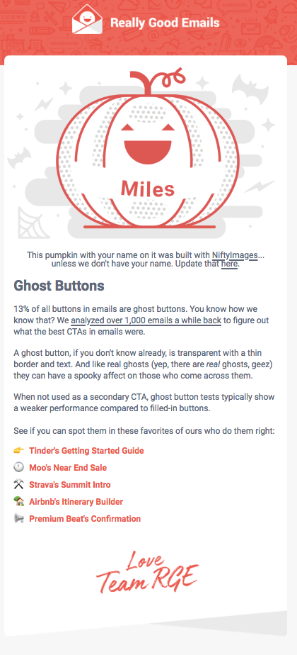
Why it works: When you do personalization in a not-creepy and non-invasive way, it could be fun. This newsletter example from Really Good Emails shows just that. It’s a neat party trick that really goes a long way in making your contacts feel valued. What do you know, Really Good Emails sends out...really good emails - certainly good in the business of email curation.
Followed by fellow #emailgeeks, Really Good Emails knows how to engage with its community and this newsletter, with its relevant content, is no exception.
Actionable insights: Really Good Emails uses NiftyImages to optimize their personalization. Scene7 is also another alternative.
Point is, you should use tools to optimize your email personalization, which should be data-centric but person-led. You should see recurring data trends, but create best practices within the context of your own company. At Mailjet, we have a whole list of integrations you can use to ensure that your emails are as personalized as possible.
Newsletter example #4: The simple elegance of Taylor Stitch’s menswear email

Taylor Stitch Menswear Email
Why it works: As you’ve already seen in AdWeek’s newsletter example, a minimalist design can go a long way. Taylor Stitch’s before-the-fold image is an impactful way to market their product, emphasizing versatility through different backdrops. Not only do they have clothing attire for the metropolitan, concrete jungle, they also have good jackets you can wear for an actual jungle expedition. This image also sets the content narrative as you scroll down the newsletter - their clothes are great for the city, forest and mountains. By presenting a solid aesthetic for their menswear campaign, their email branding plays around the notion of simple sophistication.
The headings translate this feeling into design, with the use of a serif font indicating maturity and elegance, and their overlaid placement over the empty, white space and images accentuate this duality as presented in the above-the-fold image. They’re traditional but not rigidly conventional. This is a well-conceived, strongly-branded newsletter.
Actionable insights: This is a great blend of content and design, and the content doesn’t even have to be creative, but effective. By creating an overall engaging layout, the products themselves pop-out; the white space allows customers to see the products clearly, and on mobile, an area to click on.
Finally, be aware of the colour palette you're using. Here, the analogous colours make everything cohesive - and it's done very carefully. For example the font headings are overlaid on the lighter parts of the image to ensure legibility, and each photo's hue has been modified to fit with the overall aesthetic. Consider these minute details in designing your emails.
Newsletter sample #5: Station F’s exuberant originality
Station F Anniversary Newsletter
Why it works: As Station F, the (in)famous French startup incubator, states: “What the F*ck?!” Celebrating their first year, Station F has created a very… explosive email: bright colours, fabulous visuals (pink flamingo!), some gifs here and some emojis there to spice up this eleganza... this newsletter grabs your attention, doesn’t let it go, and incites curiosity. What kind of hijinks are they up to for their one-year anniversary? After making such a loud newsletter, they better deliver. These are techniques that you can use to shine the brightest in that inbox filled with other emails.
Actionable insights: Use .GIFS. Be interactive with your design, and be creative with your CTAs. Use colours to incite interest whether consciously or...subconsciously.
Newsletter example #6: The rich media of this DMA Awards-shortlisted Blue Planet II email newsletter
Why it works: This Blue Planet II rich media newsletter by Action Rocket, a UK-based email marketing creative agency, has been recently shortlisted for the DMA Awards 2018, and it’s clear why: it contains dynamic design elements that interact really well with each other. For one, it does not shy away from scrollability and even includes it as an integral element. Above-the-fold, a lone walrus greets you above a sheet of ice, barely surviving from the dangers lurking down below.
Then, the arrows pointing downwards encourage you to dive deeper into the email. What you find as you go down is a series of interesting animal facts, with some nice moving background to boot, until you finally reach the Challenger deep - the deepest place on Earth. It is an incredible journey as they state in the copy. Most importantly, the small facts create buzz around the show by inducing a sense of wonder - much like in a picture encyclopaedia.
Actionable insights: All the previous letters and this have in common - an overarching narrative effectively conveyed by content and design. Notice that this time around there are no clear CTAs above-the-fold. The CTAs in the end create more interest around this show and its content. In your emails, you should also focus on the hierarchy of importance as done here. A marketing copy with links and CTAs arranged haphazardly can be confusing, after all.

Blue Planet II Announcement Email
I'm sure we missed many awesome emails, and with each passing day brands are continuing to innovate on their email design, copy, and optimization. What are you going to do innovate your emails this year?
